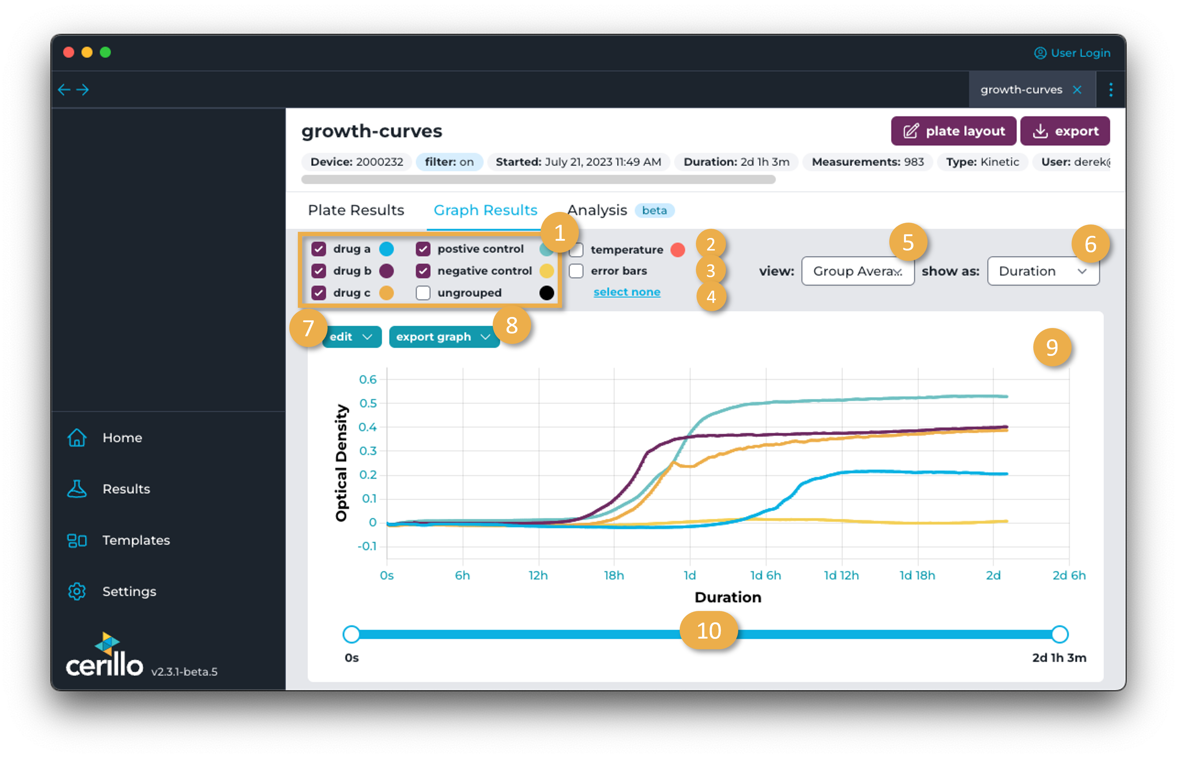
Graph Results
Displays graphical representation of the optical density of the experiment over time.
Number |
Element |
Description |
|---|---|---|
1 |
Group Visibility Toggle |
Click the checkbox for a group to toggle its visibility in the graph. Wells not assigned to a group can be viewed with the UNGROUPED toggle. |
2 |
Temperature Toggle |
Toggle visibility of temperature over time. Temperature axis will be on the right-side of the graph when visible. |
3 |
Error Bar Toggle |
Click this checkbox to visualize standard deviation for the group. |
4 |
Select All/None |
Toggle on/off visibility of all groups. |
5 |
View Select |
Toggle between Group Average of the wells assigned to a group or Individual Wells to see each well plotted individually. |
6 |
Show As Select |
Toggle between time axis. Options are Timestamp and Duration. |
7 |
Edit Menu |
Edit y axis and filters. For axis edits, can edit the OD axis minimum and maximum, or set to a base 10 logarithmic scale. Useful for comparing different experiments or for zooming in on a particular region of the data. See time-series filters for more details on time-series filter options and implementation details. |
8 |
Export Graph |
Export the graph as a |
9 |
Graph Results |
Representation of optical density measurements over time. If wells are assigned to a group in the plate layout, they will appear with the color of that group and can be displayed or hidden with the [Group Visibility Toggle]. Hover over the graph to see the optical density at that point in time. |
10 |
Time Slider |
Drag the left circle to limit the earliest measurement displayed in the graph. Drag the blue portion of the slider to move the window of the time range earlier or later. Drag the right circle to limit the latest measurement displayed in the graph. |